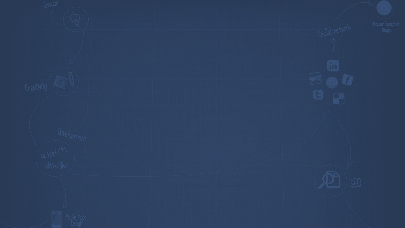

Web Design Blog
Usability Errors to Avoid While Doing Web Designing
10 January 2018 by mintlogix
These days, the user interface is a top priority while developing a website. These days, people are more focused towards those websites which look captivating in its looks and design and this is the reason that they look for alternates if they don’t find a website interesting.
However, there are web designers who are still making mistakes in designing a website which are resulting in poor ranking and inappropriate user interface. Let us understand those mistakes and how someone can eradicate them as well.
- Focus on the Homepage: If you are giving much importance to your homepage only and not to the other pages of your website, this may give a bad experience to its users. Every page has its own value and these pages are redirected when a person is looking for that relevant content. It is important that you should give equal importance to every page apart from homepage in designing it properly. Different colors, sizes and designs are important in making that page look beautiful. This also gives a reason to people for the information they are looking for.
- Hierarchy Lack: The pages are to be designed in such a way that looks in a series to customers. You can set up those pages as you want them in front of your customers. This makes sense and offers them an easy interface with the website and they can look what they are looking for. If the pages are not in a proper series, this may cause a little problem to the customers in viewing them. In order to offer great interface of your website to the customers, you need to design with proper layout, font and color. This also helps them in knowing what they want to know.
- Navigation: You need to add some navigational links which people are looking to explore to get some more contents on the niches that they are looking for. This one mistake that can lead your web page rank last in the ranking over search engine. Also it is important to add some relevant navigational links instead of giving any navigation. It is important for the designers to note that they should add only those links which are important and useful where customers can get contents what they are looking for. Don’t make confusion for your customers while redirecting them to the navigational sites.
- Overload Information: This is something to which everyone should be focused. The reason is that contents are the backbone of a website. This is important that only relevant content should be published on the web page. In this regard, if you will add some inappropriate or overload content, this can make customers a little confused in what they are reading.
- Secret Information: This secret information is related to the contact details. Generally websites do reveal their contact details but some of them keep it as a secret. You need to understand the importance of contact us page for your customers. This makes easier for them to contact you.
- Inconsistency: You need to design your website in a proper and consistent manner. This includes that when you are putting subheading, design of the webpage, its layout then it should be in a proper manner. All the subheadings and page layout are to be in the same format as the first one. Similarly it is important for the textures and designs as well.
- Non Responsive Design: This means that you need to design your website in such a manner that it should be visible on smartphones also. Most of the people these days usually visit any website on their smartphones itself. Thus, the interface over phones should be normal and responsive.