

Services
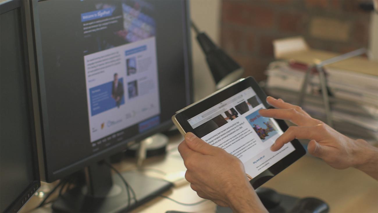
Responsive & Mobile
The gap between internet access through mobile & other hand-held devices and laptops/desktops is fast closing down. We create websites that render beautifully on all screen sizes including that of smart-phones or other devices.
Responsive web design is a device-independent approach to delivering content to users. From mobile browsers to television screens, responsive websites are able to adjust the site appearance based on the screen dimensions. Responsive web design today is the de-facto standard for all websites and apps. Websites that are not responsive today are missing out on a large volume of their target audience.
We can no longer afford to cater only to the desktop users. As Jeffery Veen says, “Day by day, the number of devices, platforms, and browsers that need to work with your site grows. Responsive web design represents a fundamental shift in how we’ll build websites for the decade to come.”
Imagine a situation where a person starts browsing a site on his desktop in the office, switches to mobile browsing at his home and mends up playing a game on the site on his TV. It will be a show-stopper if the pages fail to adjust to the screen sizes and load quickly. Not only the screen sizes, your website also needs to take into account the device orientation, and the underlying technological platform into consideration.

The practice consists of a mix of flexible grids and layouts, images and an intelligent use of CSS media queries. As the user switches from their laptop to iPad, the website should automatically switch to accommodate for resolution, image size and scripting abilities. In other words, the website should have the technology to automatically respond to the user’s preferences. This would eliminate the need for a different design and development phase for each new gadget on the market.
Some of the key benefits of a responsive design are:
- Most importantly, your site will render seamlessly on smart-phones, notebooks, tablets and desktops.
- Following the above, you will have less bounces and increased traction on your site.
- A responsive site will also help in the SEO efforts. Google recommends that a single URL be used for displaying content across devices. This means that instead of having a mobile version of your site, you need to have a responsive one.
Contact us today for your responsive design requirements.
Responsive Design
The second and most common method is for us to build your new site responsively. By being responsive we mean building for a variety of screen sizes, not just the extreme cases of large desktop monitors and small hand-held devices. We will also be catering for iPads and other tablet devices.
Reasons Include:
- A single website to build and maintain via a content management system
- Future-friendly, because the layout will redistribute based on screen size and not just the size of today’s popular devices
- A better content-focused user experience
Try for Yourself
Have a look at the following websites that we have built using responsive techniques and drag the corner of your browser to replicate different screen resolutions: www.agentspropertyauction.com and www.simpsonyork.co.uk and www.manwith3heads.com. You will see that content and layout changes depending what size you have you screen.
Next: Search (SEO)